Learning Studio / features
Fine-tune per-device block styling
Adjust a block’s spacing, border, effects, and typography for each device.
Per-device advanced block styling
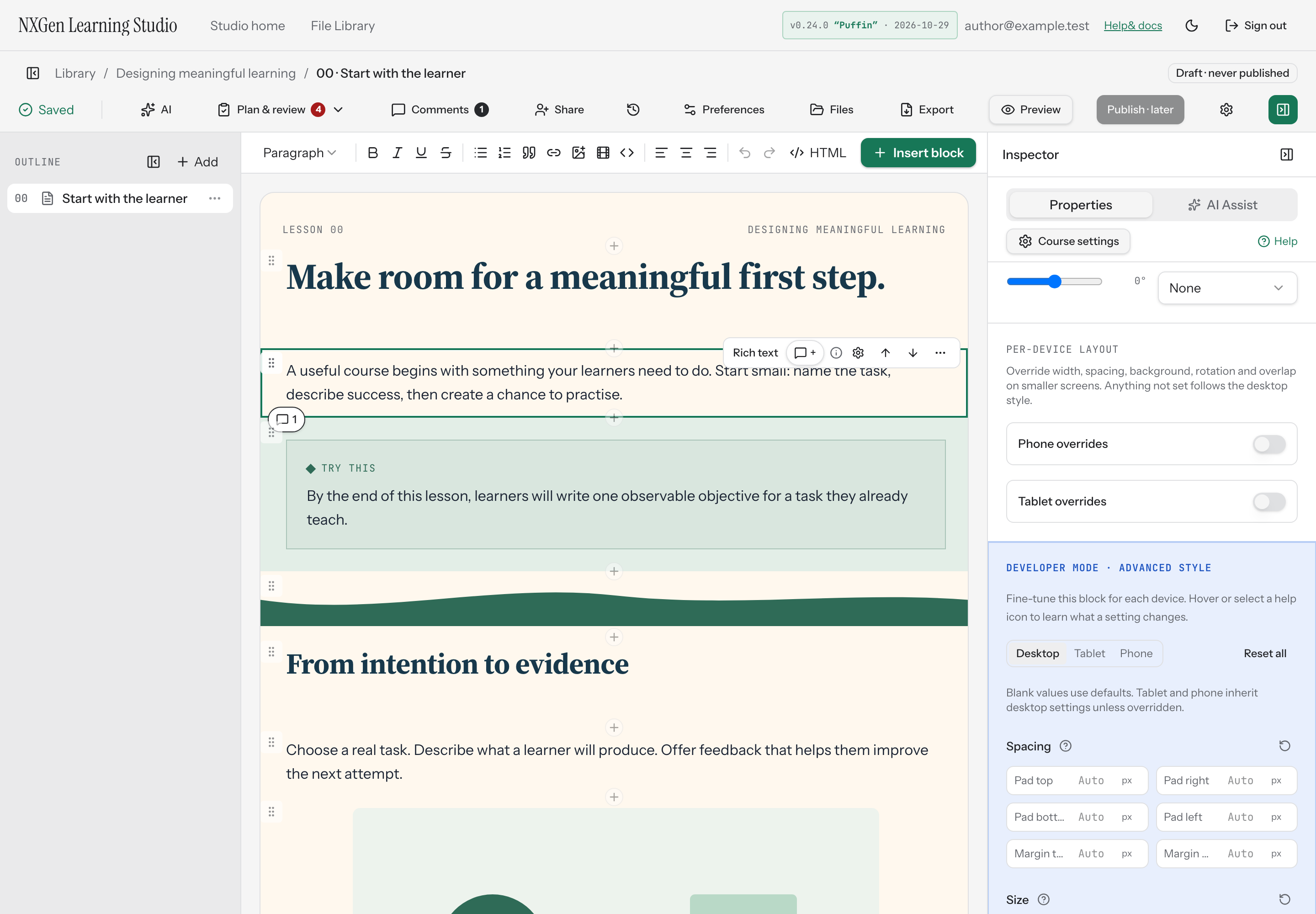
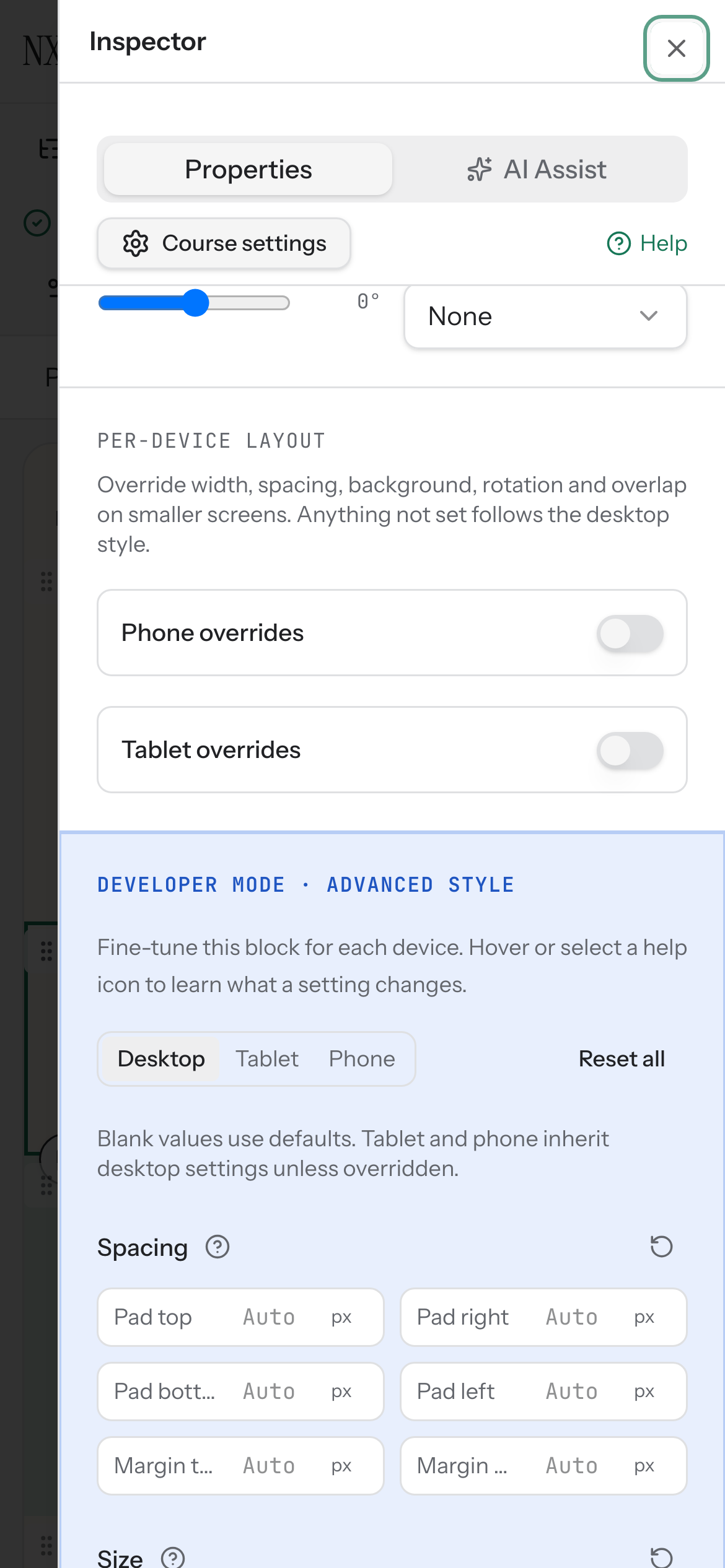
Section titled “Per-device advanced block styling”Developer Mode exposes fine-grained style controls for individual blocks. You can adjust spacing, size, border, effects, transform, and text properties separately for desktop, tablet, and phone. Each group has its own reset, and a full reset clears all overrides for the active device.
How to use it
Section titled “How to use it”- Open Preferences and enable Developer Mode in the Optional advanced tools card. Select a block in the editor and open the Developer Mode · advanced style group in the inspector.
- Choose a device — desktop, tablet, or phone — using the toggle at the top.
- Adjust properties within each group:
- Spacing: padding top/right/bottom/left and margin top/bottom.
- Size: max width and min height.
- Border: width, style, color, and per-corner radius.
- Effects: shadow, blend mode, opacity, blur, and backdrop blur.
- Transform: scale, offset X, and offset Y.
- Text: font size, line height, letter spacing, font weight, text case, text alignment, and max lines. Text controls appear only for text-bearing block types: text, callout, quote, button, checklist, copy prompt, objectives, accordion, and tabs.
- Use the reset icon on any group heading to clear just that group, or use Reset all (desktop) or Reset to desktop (tablet/phone) at the top.
Numeric values are clamped to allowed ranges. Leaving a field blank sets it to auto. The panel is disabled when the block is locked.
Availability and limits
Section titled “Availability and limits”Developer Mode is a preference for this browser. Turning it off hides the extra controls and keeps existing block styles. Use the style reset controls when you want to remove those styles. No raw CSS is accepted — only the properties in the panel are available.
Text properties are only available for block types that render text.