Learning Studio / features
Configure separator blocks
Set separator shape, fill color, height, and flip or rotation.
Configure a separator block
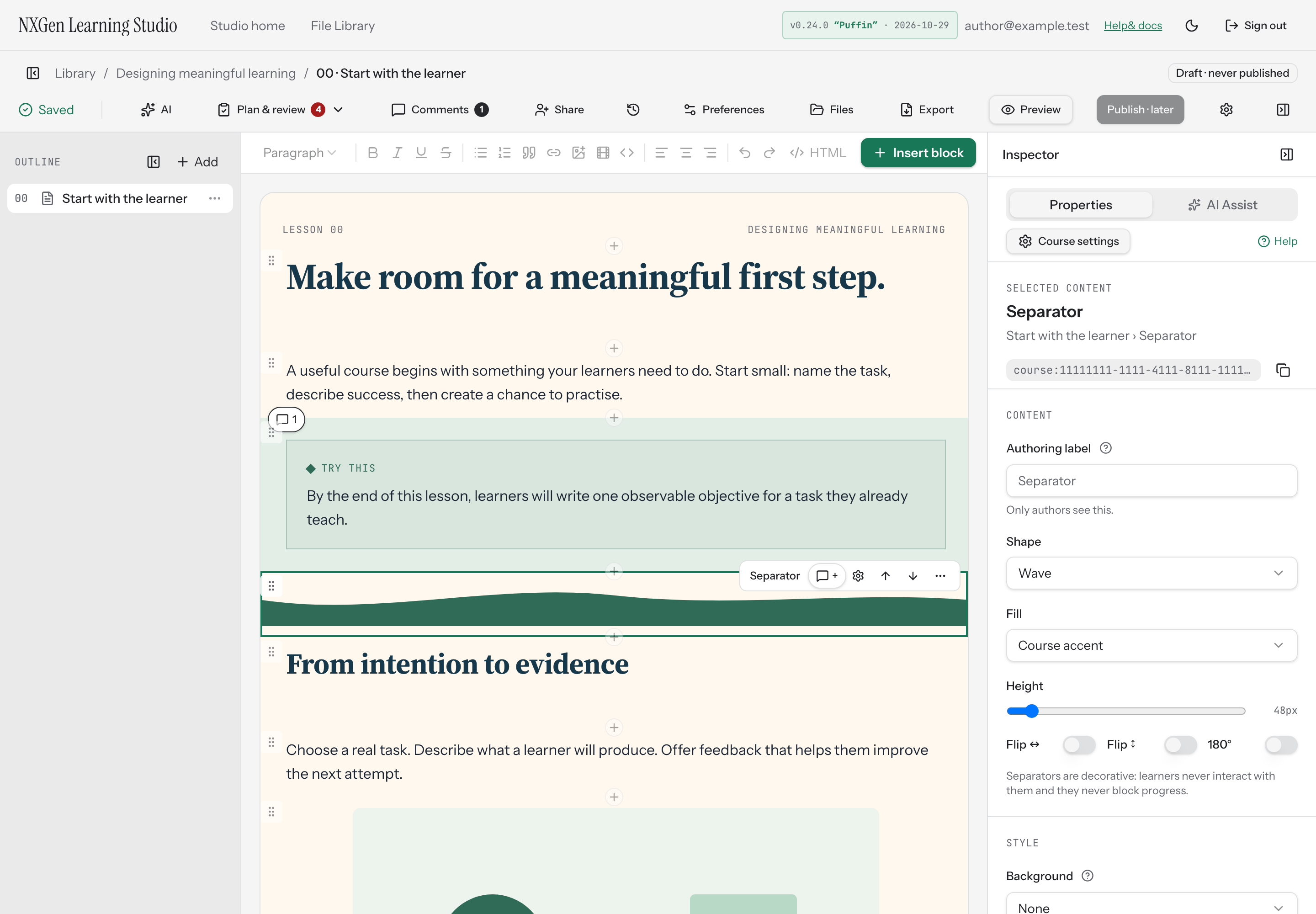
Section titled “Configure a separator block”A separator block adds a decorative shape between sections of a page. It is purely visual: learners never interact with it, and it never affects progress. The block’s default style is full-bleed width with no padding.
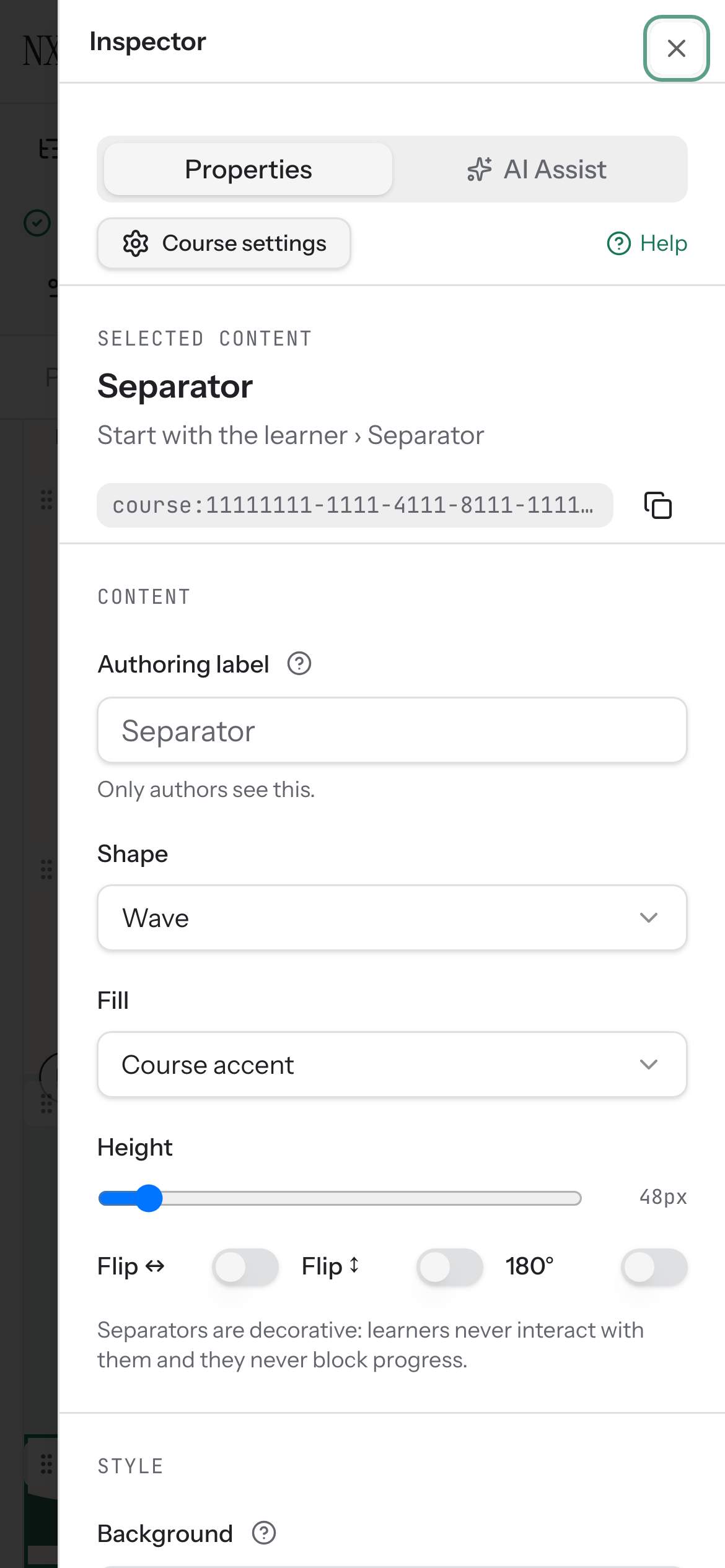
When you select a separator block, the inspector shows its properties:
- Shape — choose Wave, Mountain, Angle, or Gradient.
- Fill — use a course token (Course accent, Course panel, Course heading, or Course text) or a custom hex color.
- Height — drag the slider between 24 and 320 pixels.
- Flip ↔ — mirror the separator horizontally.
- Flip ↕ — mirror the separator vertically.
- 180° — rotate the separator 180 degrees.