Learning Studio / features
Apply a reading layout to a page
Use an opt-in reading layout to narrow content width and tighten block spacing for a focused reading experience across devices.
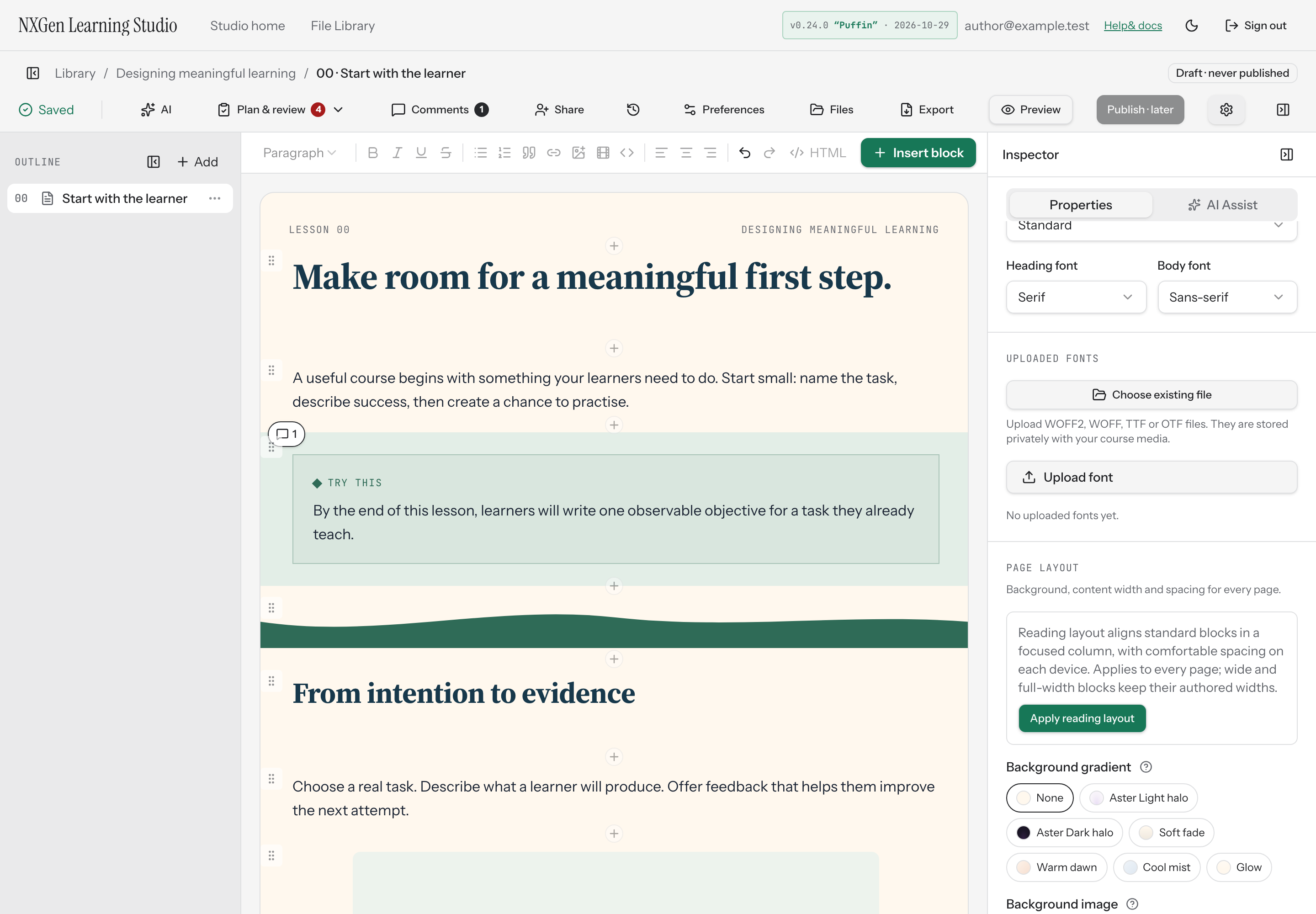
Apply a reading layout
Section titled “Apply a reading layout”A reading layout narrows the content column and tightens block spacing across every page, giving learners a focused reading experience on any device. It works alongside your existing course background — gradient or uploaded image — so you don’t have to choose between ambiance and readability.
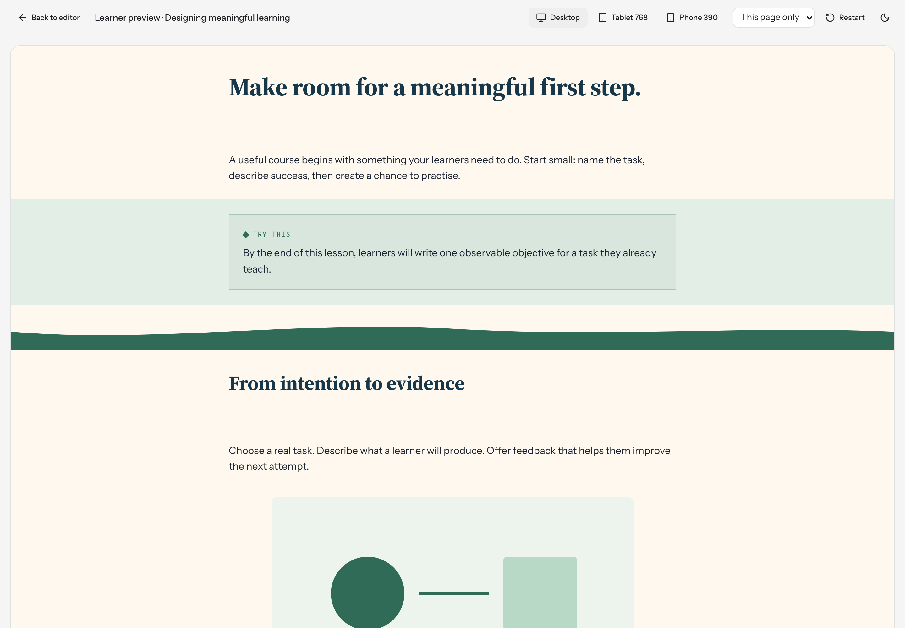
The reading layout sets a content width of 760 pixels on desktop, with progressively tighter block spacing on tablet and phone. Wide and full-width blocks keep their authored widths, so pages with media or columns still look intentional.
How to use it
Section titled “How to use it”- Open your course in the studio editor.
- Select the course (click the canvas background or choose Course settings) to show the inspector’s course-level properties.
- Scroll to the Page layout group.
- Select Apply reading layout.
- Open Preview to check the narrower column and spacing on desktop, tablet, and phone sizes.
After applying, the content-width and block-spacing sliders update to the reading-layout values. Adjust them further if a specific page needs more or less room — changes apply to every page in the course.
Availability and limits
Section titled “Availability and limits”The reading layout is a course-wide setting: it applies to all pages at once, and there’s no per-page override. Your background gradient or image is retained when you apply it, but the content width and block spacing are replaced.
Content width is clamped to 480–1600 pixels and block spacing to 0–160 pixels. If you switch to a different device tab in the page-layout panel, you can adjust tablet and phone spacing independently; the reading layout pre-fills sensible defaults for each.